
NGL though I dig the style of the new icon too, but where’d the shark go?
I love the style of the new icon but prefered the Haj(shark), I feel like the blahaj was more representative of this community 🤷🏻♀️
Also wish there was an actual vote for this
Gonna bring it up in our matrix chat
i also like the old one better. the comf haj saying hello in space makes me feel at home… this new one looks cool and such buuuut doesn’t give me many human-vibes somehow.
There was one, we voted by hollering into the thread when it came up.
the silhouette is a shark though
It looks like a heart to me.
I don’t see it, even threw it in gimp to do the TF2 silhouette test
I like it more. It’s far easier to recognize in the list of communities when it’s small.
It’s also the same style as !196@pawb.social
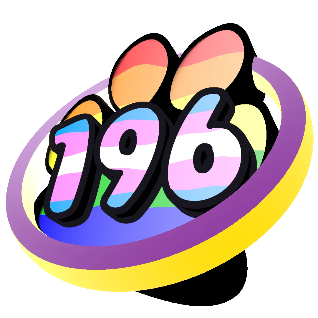
NGL I really dig the big version!
I do agree. This is nice but I feel it looks repetitive because it shows up right next the community tittle, so it looks like “196 196”. Idk what else to say. Maybe this icon could be in the banner? I just love that people be posting their art.
What if we could have the blahaj in this style? Ofc, this is depending upon how busy @Unknown_0671@lemmy.blahaj.zone is. They’re a professional logo designer after all, and the current 196 logo is something that they did for free.
it may be possible if i get the blahaj model from itch.io. but i doubt ill have time for a while for that. i could remove the text ‘196’ as well, but then it would be very similar to old icon just done in different colors.
to clear the other things posted here, the silhouette isn’t a shark, at least it’s not intended. there’s a trans heart behind the ‘196’. with an intersex ring around it
as for which icon to keep, its upto the people. i dont mind either
The silhouette is of blahaj :)
No, it’s a sombrero
I am on the same page as the rest here. But I just noticed the ring in the logo is riffing off the intersex flag and I love that. Nice touch.
I think it’s still there, just behind the 196 and harder to see.
I think that’s a heart.
woah there is also a heart, but the sillouette is a shark
(guys how do i spell siluwet)


![WHERE SHARK GO‽‽‽ [Rule]](https://lemmy.blahaj.zone/pictrs/image/eaec18c9-6f49-4014-a4a7-9252e7b928e2.webp)