


Nuclear exposure causes a liking for anime titties got it.
Yes!!!
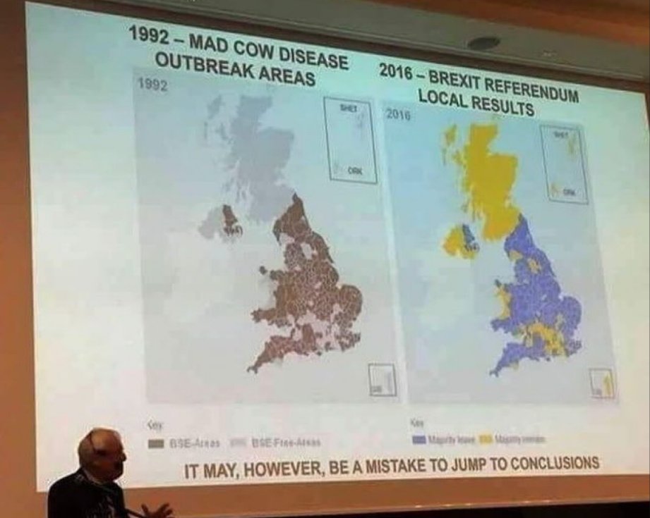
IT MAY, HOWEVER, BE A MISTAKE TO JUMP TO CONCLUSIONS
Reminds me of r/peopleliveincities, or that one time a 5G hater showed me a map of 5G towers, then a map of people getting sick of some disease or other. They matched!
There are more tractor injuries in areas with more cows. This does not mean that the cows are driving the tractors.
Probably best we start separating them though eh? Just to be on the safe side
You might think so, but the best option is actually to put traffic lights out in the fields (which might actually be close enough to plausible to convince somebody with bad maps).
It may be true (as in it may be satire), but this site’s fact check is a bit lame. Basically just “trust us, it’s fake”.
It’s an insubstantial article, but it is the exact same graphic. Everything’s identical except for the legend, date, and color scale, even the spacing of the legend.
The font on the legend is different, however, which you wouldn’t expect if someone had independently mapped both incidents. The font of the year is identical, but it’s reasonable to assume it was added for both maps.
A very quick flick through image results shows the EU Referendum map is taken straight from the BBC.
(Edit: I can’t say I’m not disappointed that Snopes didn’t do a better job, since this took me less that five minutes on mobile.)
it says that there’s no way it is true because the mad cow map is just brexit in grayscale, an assessment i agree with
A map of the propagation of an infection would have gradations. Knowing how prevalent the illness is is critical information.
Unlike an election an illness doesn’t win a municipality when exceeding a certain threshold.
The correlation assumes that intelligence was involved

Those damn cows


