
In response to a wave of backlash this morning, Marvel has denied the use of AI in the creation of a new “Fantastic Four: First Steps” poster.
This all just looks like humans over analyzing the shit out of every piece of art now and anything that’s not perfect is now the result of AI. The “we 4 you” is obviously on purpose a cutesy version of “we ❤️ you.” Anyone who argues otherwise is an idiot.
It looks like AI.
Every single thing circled also looks like the work of humans.
Humans don’t tend to forget the number of fingers humans have
When you get photo shopping a crowd together you take many artistic liberties to get the look you are going for. It’s all about budget and deadlines how far you’d go.
First off, that’s blurry as fuck and it looks like the 4th could be cut off by another figure in the scene. Second this isn’t some fine art piece, it’s marketing materials made for a deadline on a budget. Things are composted, duplicated, and skipped in order to make something that looks good at a glance.
I mean tbf I really don’t care about this as much as you so if you want the win you can have it
I’m just sick of the head in the ground uneducated “nothing is real” crowd.
thats why every single human made cartoon has humans with 5 fingers, right?
No the fuck it doesn’t.
I’ll just copy and paste the same thing I said to the other fool, “this isn’t some fine art piece, it’s marketing materials made for a deadline on a budget. Things are composted, duplicated, and skipped in order to make something that looks good at a glance.”
“This isn’t AI. And if it is, it doesn’t matter.”
That’s not what I said. I’m saying the imperfections people who don’t know what they are talking about are stretching to say it’s AI are the exact kind of things humans cutting corners do on this kind of work.
AI slop looks different. This is just regular human slop.
I’m with you, almost all of the things circled are either over-analysis or the work of an artist who didn’t know what they were doing.
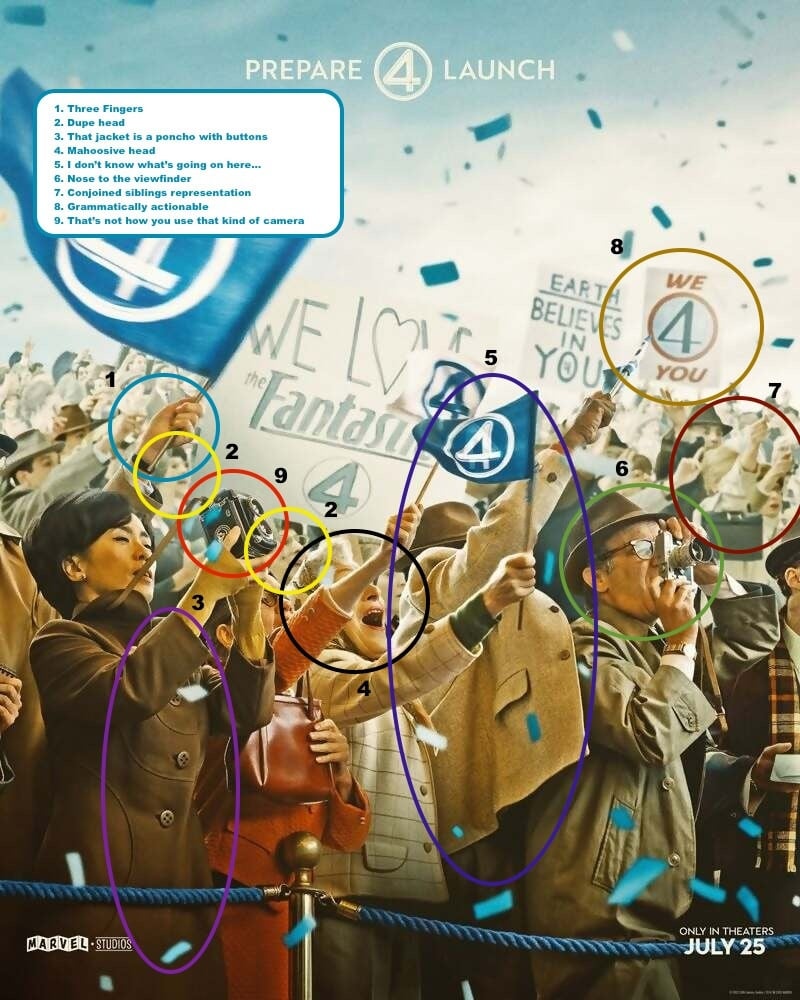
Example of over-analysis: the dupe head. Copy/paste exists in CGI programs
Another example of over-analysis: the poncho with buttons. Fashion police much? It’s a fictional universe.
Example of artist not knowing what they’re doing: the “camera that isn’t used like that.” Artist could’ve been too young to know how it was used and didn’t bother looking it up
The only one I could kinda agree with was the nose against the viewfinder but even that could’ve just been shitty use of lighting & perspective on the artist’s part
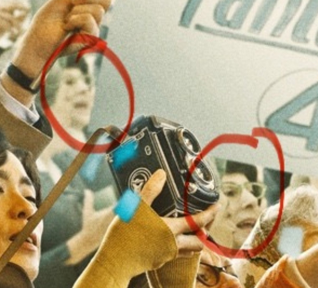
Rangefinders have the viewport on the side.

My assumption is that it’s just a poorly timed shot, where the camera operator is in the process of winding it after taking a picture.
Except for calling people who argue with you idiots, I agree with you. This looks like a Photoshop job, AI is way sloppier.
I’m sorry, but only an idiot could think that “we 4 you” is some kind of AI slop. It’s clearly intentional. Humans do that exact kind of thing all the time. People are looking for reasons to be angry and all those things pointed out are borderline at best. That piece is clearly intentional.
Especially since one of the background banners has a perfectly normal sentence on it.
Are you implying the Disney company would tell lies??
#6 is a rangefinder camera. The viewport is on the right side. He’s looking through it like old people who wear glasses would.
9: what’s the deal with the camera strap?
Looks fine to me. I would expect a leather strap to twist like that, and to pull at a collar that way.
The only valid criticism here is the three fingers thing. The rest are just dumb. There are much more plausible reasons for those things than “OMG A.I.!”
3 is wrong, you can clearly see where one side of the coat ends.
The hand between 5 and 8 wouldn’t be holding a flag at that angle
“It isn’t AI, our marketing team is just incompetent!”
The three fingers and a thumb is obviously an homage to The Thing.
/s
Beyond the weird AI quirks, there is a lot with the overall composition that competent artist or designer wouldn’t do. Random blurs on things in motion with no apparent purpose and just distract. The perspective of the crowd is just weirdly stacked like filler. Using atmospheric perspective improperly. This is like a soup of artist tricks applied improperly.
Everything appears to be chaos with no logical order or intent to guide the viewer. The overall hierarchy of key elements is way off, there is no hint where or what to look at. The title is almost lost in the mess.
Anyhow just appears like something AI would do or a very untrained designer who doesn’t understand visual communication well.
Looks like they would have been better off snapping a photo during the filming than cobbling together this visual abomination.
The only really damning ones i see are the duplicate face and the three fingers, and i actually think both are not signs of AI. With the 3 fingers, it looks like his index finger might be perched on the other side of the flagpole out of view, like some people hold a pencil. With the duplicate face, that seems much more like a human error. A graphic artist filling in the background got lazy. The whole thing does have a kind of fultered overproduced look that reminds me of some AI stuff, but I don’t see anything conclusive, and a lot of the examples pointed out below are definitely baseless.