
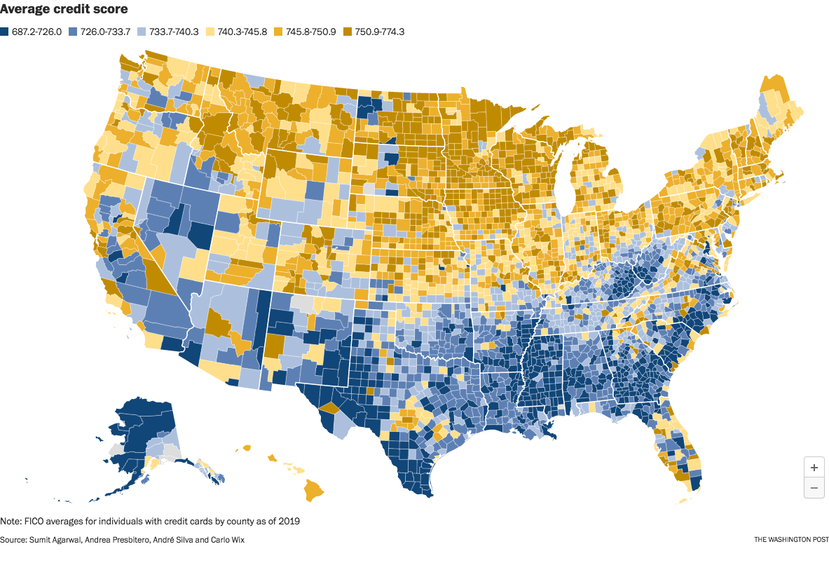
The image is from a Washington Post article which took the data from an interesting research paper titled Who Pays For Your Rewards? Redistribution in the Credit Card Market.
The research paper is a good read. (A free PDF of the whole paper is available at the link.) It examines how the use of rewards credit cards results in a massive wealth transfer from low-credit-score customers to high-credit-score customers:
We estimate an aggregate annual redistribution of $15 billion from less to more educated, poorer to richer, and high to low minority areas, widening existing disparities.
The Washington Post article attempts to frame the clear north-south split as a result of healthcare issues in the south. That explanation seems too narrow to me. This map looks too similar to maps of poverty and education, and we know health correlates strongly with both of those issues.
Edit to fix a sentence fragment. Sorry; it was late and I was tired.
You must log in or register to comment.
Interesting data but I hate this map. The colours are nonsensical as are the categories
Maybe they’re more color-blind friendly than the typical red-green scale? Idk, it’s just a guess as to why these colors were chosen.
For fully color blind people I wished they could just do black to white with shades of gray in between.
There are colour scales that combine colours and intensities consistently, so that if you discard (or can’t percieve) colour information, you still get a nice black to white scale. For a moment, I though the map used cviridis scale, which has this property and is designed to look as similar as possible to people with various variants of colour blindness. But then I realised that the scale used here has the brightest point in the middle, not on one side.
It doesn’t work well for someone with achromatopsia.
Cviridis or whatever they used here? Cviridis (and other scales constructed with the same philosophy) does.
I like the colors. Much nicer than typical colourscales
Yea who the fuck designed this color scheme. And the data points being so…random? Why not go by 50 or 100…
Could be a choice to reflect the distribution of different scores. I can’t imagine credit scores are a very linear distribution.
It also doesn’t go low and high enough. The first and last category should show everything below and everything above respectively.
I mean a 687 credit score isn’t ideal but it’s far from how bad it can get.
Pretty much a map of poverty levels and areas where minorities are concentrated, not surprising.
How do you explain Minnesota then?
First you have to purify yourself in the waters of Lake Minnetonka
Pre covid. I would like to see one more recent.
I’m sure nothing can be inferred from the dark blue region that follows the rust belt exactly
I blame it on the iron oxide
So you’re saying that the Gulf Coast gives people bad credit?
/s
deleted by creator

