It doesn’t even go to the ceiling! Imagine the dust.
This is what gets me. If they were forced to have load bearing pillars there, I could at least try to understand making use of the space. What is even the point of these walls?!
Everyone is so god damn obsessed with “open concept” that they try to wedge it in to places it makes no sense. When we were looking at houses, this kind of thing was everywhere. There probably used to be an enclosed rather small kitchen and then they tore down the walls and there’s no where for the fridge. So the kitchen is now invading the living room so there’s no where for furniture to really fit and the openness is broken up by this dumb enclosure which ruins the openness anyway. And it probably sold for over the asking price.
Usually it’s a flipper which generally means they have no taste, glob on to Pinterest trends, and do everything as cheaply and janky as possible.
Sounds like my house. The previous owner did all of the decorating, and she was not talented. I’ve only recently bought the house so I keep wondering around and looking at bits and going, why the hell did you do that.
This is a mobile home.
My uncle had one with this layout in the early 2000s.
That’s where we put the booze.
You can limit the atrocity by putting hanging plants on top.
hmm dusty plants
In some sci-fi future, there’ll be flying roombas to take care of that.
…actually, I suppose we have drones. Can drones dust? Can you strap a feather duster to one?
(Am I a single youtube search away from finding entire channels about drones with feather dusters strapped on?)
I can’t picture how plants on top will reduce dust?
Is that a thing? Indoor plants to control dust?
No, but it will make use of the fact that it doesn’t reach the ceiling and it could even look cool with a mix of plants and shelves on the sides
🌿photosynthesis 🌿
It gets worse, what’s going on with the door in the background? It looks like the wall goes to the same level as the ‘nook’ and the ceiling light is in the room beyond it.
Like there was some kind of mezzanine floor that got hamfistedly removed.I bet the door is to a pantry. They don’t need vaulted ceilings, so it’s better used as space for potted plants and the fine/display china. I’ve seen a lot of plant ledges and alcoves in newer houses. They can make the spaces appear much larger than they actually are.
ETA: the fridge enclosure is weird though. They could have just matched the bar height and put in 12-18 inch counters to make it functional
how to make a refrigerator 5x less efficient and 10x as ugly
Why less efficient?
Because it pumps heat from inside to the back, so if the back is blocked it will struggle to pump heat into that tiny overheated space
Also the heat is surrounding the fridge which slowly leaks inside making it have to work harder to cool the fridge which causes it to heat up the fridge, cycling heat into and around itself
Every single house I’ve ever lived in or seen has had the back of the refrigerator up against a wall. Are you saying they should be free standing in the middle of the room??
deleted by creator
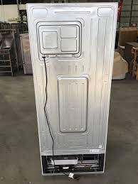
Some vent down and under and some need space. You can tell the difference by the back of the fridge, if the loop is exposed then its likely the type that needs its space. If you see a cover over the rear then this would indicate an air channel.


I have never seen a fridge with an exposed loop like that.
Really? They are quite common in older models and work well.
No room for it to breathe. Just massive amounts of expelled energy trapped in a small space.
It’s even pointed away from the kitchen??
That’s the shame part.
Is it? I think in the top right picture you are looking at the left side of the fridge not the back.
Nope, look at the floor pattern. You’re looking at the back.
Detective skillz!
My cat would find a way to be up there all day
Looks like a good spot to lie down
I’d totally paint that to look like a Tardis.
Needs a fourth wall and all painted black. Then it can teach all your apes how to use tools.
EeeeEEEEEEEeeEEEeEEEEeeeeEEEEEE!
My thought exactly. Clearly this is the home of a serious Kubrick fan.
One to four to nine, and beyond.
It’s so egregiously bad that I kinda like it.
When the architect graduated from The Sims School of Design and Urbanism
Should’ve painted it like Dr Who’s TARDIS.
That would make this awesome instead of pointless
I would remove the fridge, keep the box and explain nothing.
Put a swing in there!
A toilet. Make people wonder.
You freeze my food on the top shelf of the refrigerator side, you go into solitary. Your shelf pops off dropping my condiments, you go in solitary. You beep at me for having the door open too long while I’m loading groceries into you, in solitary. Do not fuck with me, Whirlpool.
You tell me to replace the 7 year old water filter, believe it or not solitary. We have the best refrigerators because of solitary.
You missed the ellipsis between “refrigerators” and “because”:
“We have the best refrigerators… because of solitary.”
Who would think of this? It’s so random.
It looks a lot like a retrofit solution to the original kitchen designer never actually having used a kitchen. We’ve been house-hunting for a while and it’s amazing how many newly fitted kitchens don’t have space for a fridge. Or sinks butted up against the wall or the edge of a counter so you don’t have anywhere to put the dirty dishes.
This makes me nauseous.
I hate this so much haha
It’s definitely to hide the back of the fridge which is ugly, that said I probably would have put it on the wall with the stove, and maybe moved the stove across if that was cramped.
Wow, at first I thought maybe they couldn’t put the refrigerator space there because it was a shaft, but it looks like that entire section of wall is for the closet, so I really don’t know what they were thinking here. Bizarre design. Looks like maybe the project was going out for bid when they realized they forgot to make room and this was the only solution they could come up with.


