lnxtx (xe/xem/xyr)@feddit.nl to 196English · 3 months agoVal(r)u(l)efeddit.nlimagemessage-square14fedilinkarrow-up1117
arrow-up1117imageVal(r)u(l)efeddit.nllnxtx (xe/xem/xyr)@feddit.nl to 196English · 3 months agomessage-square14fedilink
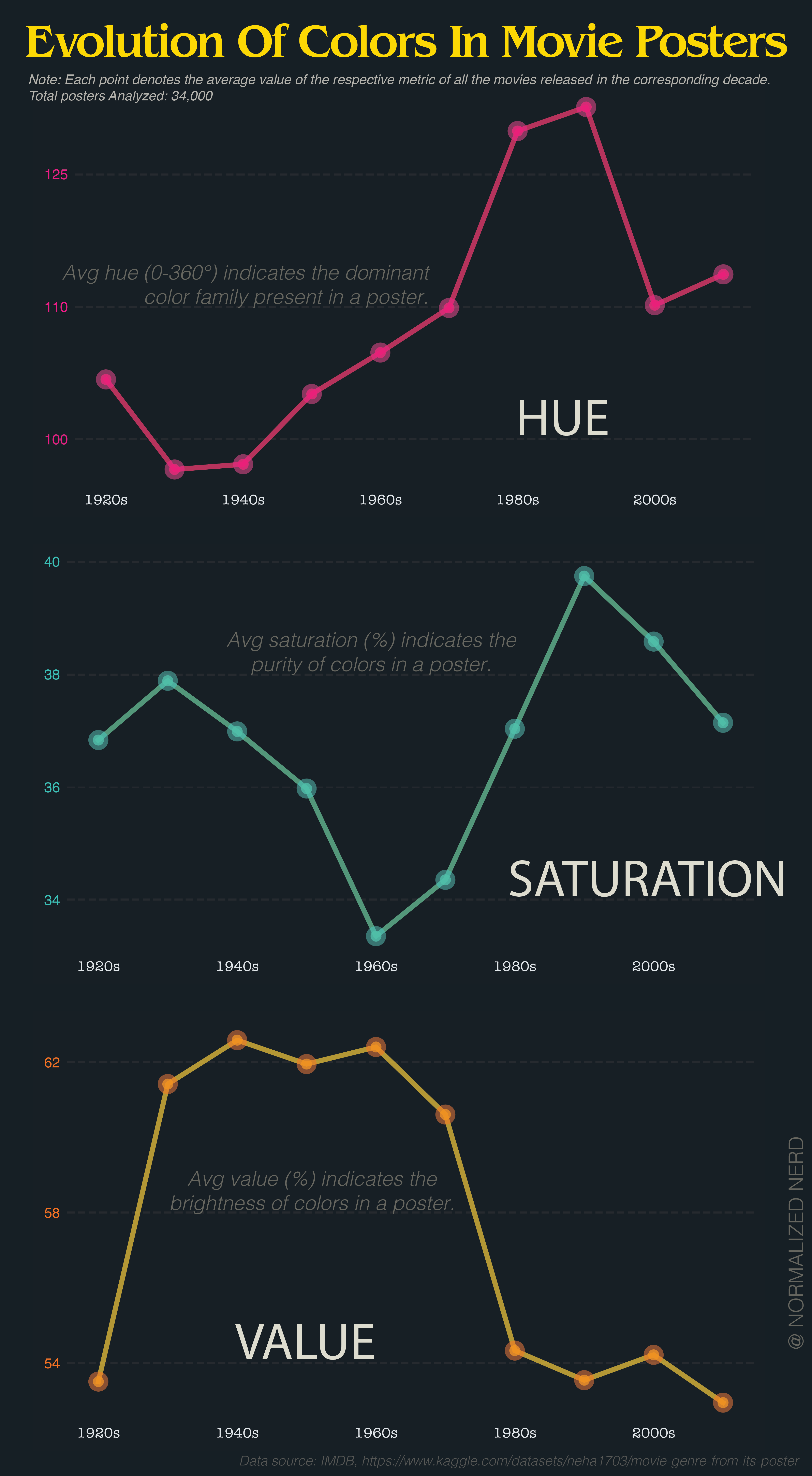
minus-squarepetrol_sniff_kinglinkfedilinkarrow-up10·3 months agoThat’d be nice. 90 and 120 are rolling through the greens. Are posters mostly green? That seems odd to me.
minus-squarebob_lemon@feddit.orglinkfedilinkarrow-up17·3 months agoThe problem is that averaging hue makes no sense at all because hue is not a longest scale. If you take a red poster (0) and a blue poster (240), it averages to green. Or take red (0) and red (359), averaging to cyan (180).
minus-squareflying_sheep@lemmy.mllinkfedilinkarrow-up7·3 months agoThe average of 0° and 359° is obviously 359.5°. it’s a radial scale.
minus-squarebob_lemon@feddit.orglinkfedilinkarrow-up9·3 months agoBy that logic, the average of red and cyan is both purple and lime. Still useless.
minus-squareflying_sheep@lemmy.mllinkfedilinkarrow-up2·3 months agoNot if there is a clear trend. If most movie posters are blue, three average will be blue. But i agree, it is useless if there is no clear trend.
minus-squareflying_sheep@lemmy.mllinkfedilinkarrow-up6·3 months agoYou know what, I completely agree.

That’d be nice.
90 and 120 are rolling through the greens. Are posters mostly green? That seems odd to me.
The problem is that averaging hue makes no sense at all because hue is not a longest scale.
If you take a red poster (0) and a blue poster (240), it averages to green. Or take red (0) and red (359), averaging to cyan (180).
The average of 0° and 359° is obviously 359.5°.
it’s a radial scale.
By that logic, the average of red and cyan is both purple and lime. Still useless.
Not if there is a clear trend. If most movie posters are blue, three average will be blue.
But i agree, it is useless if there is no clear trend.
deleted by creator
You know what, I completely agree.
deleted by creator