
Choose Your Preferred Interface
Blåhaj Lemmy offers multiple frontend interfaces. Select the one that suits you best!
(hint: mouse-over the images to see the light/dark themes)
Photon
A sleek, modern interface with a clean design and smooth animations

mlmym
Old Reddit style interface - familiar and functional

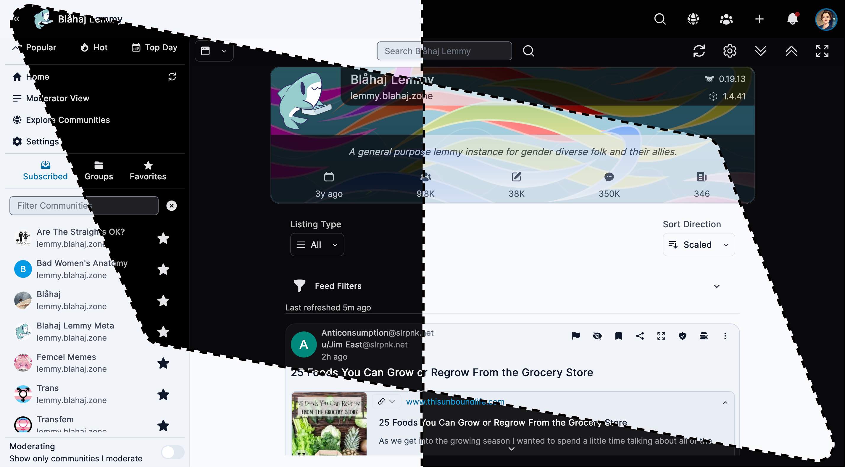
Alexandrite
A beautiful, desktop-focused interface with powerful features
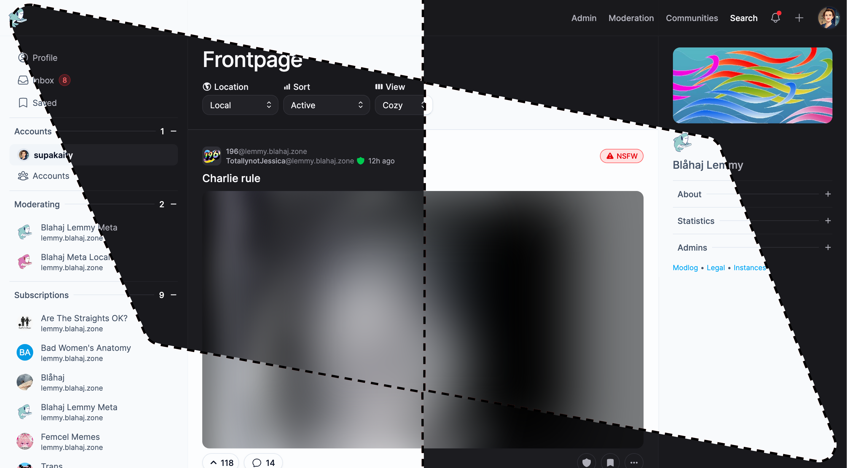
Tesseract
Feature-rich interface with advanced moderation tools

Blorp
Modern Threadiverse client for Lemmy & PieFed with native apps
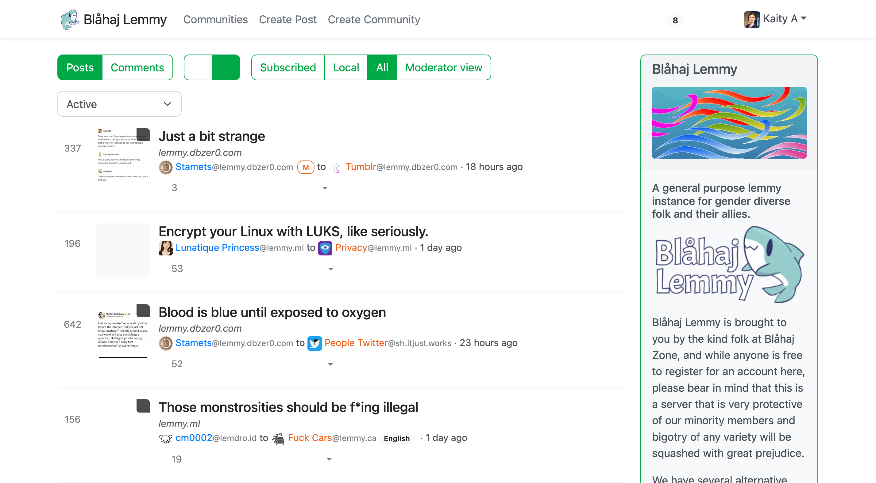
Lemmy UI
The default Lemmy interface - simple and straightforward
Current saved preference: