Almost makes me wish they still had steve ballmer doing his thing. Would’ve been some good spice for the video.
- 3 Posts
- 29 Comments

 1·1 month ago
deleted by creator

 3·1 month ago
This is a place to post limited-time giveaways of full video games that are then yours to keep forever at no cost.
Included free with Prime
So I’ll get it “free” if I start paying amazon a monthly subscription. I’d rather pay for the game directly.
linked critics to Jeffrey Epstein.
If you’re against me, you’re a pedo!

 13·1 month ago
I too have made the mistake of flipping an if statement. It was clearly supposed to happen to non-HP cartridges.
Who runs a malicious spam campaign with their own name and face? If the pictures are stolen, setting up a whole meme community is kind of a shit thing to do.
 3·1 month ago
ProStreet got ignored in my circles because it was different, but maybe it was a mistake, that looks fun.
She’s actually the real spammer?
I really feel bad for whoever is in these pictures.
I had a friend with burnout 3. A lot of time was spent on crash mode. Also have paradise on PC, but I didn’t play it that much.
Have to install paradise again and get into it properly.

 3·2 months ago
Is that mouth just a texture with the camera angle painted on it?
Honestly that’s just great.
Might be Midnight Club. PS2 is where I got in.
It wasn’t a remaster, and not really a remake either, as the games are completely different. I think it would’ve been better off released with its own title, or even in a different series as it was very Burnout-y, being made by Criterion.
I wouldn’t call them my favourites, but I will call them a perfect fit. The licensed soundtrack in MW has exactly the correct feel for the game.
Oh cool, I kind of got interested in this stuff last year and read a short book about it.
A track is a series of challenges (corners), separated by straights, which give you a breather to recover and prepare for the next corner. In a circuit, you get multiple attempts to learn and improve your execution of those challenges. I’ve been thinking about ways to incorporate that into other genres as well.
https://danielprimed.com/old_site/speed-boost-the-hidden-secrets-behind-arcade-racing-design/
The author also wrote some 500-600 page breakdown of Wario Land 4, which I also bought, but haven’t dared to start reading yet.
I have it on loan. I recall being told this one wasn’t that expensive when bought a few years ago, so it was an instant decision for someone looking for a ps2. I’d have done the same.
Are you spying on me mate
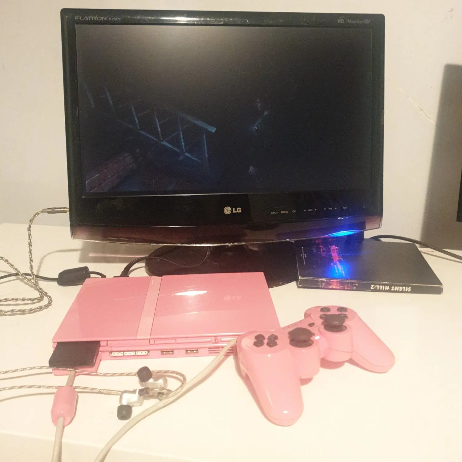
Posting that while I’m going at it with this setup

I’m surprised they survived this long, being a crappy imitation brand that also committed fraud.


deleted by creator