You must log in or register to comment.
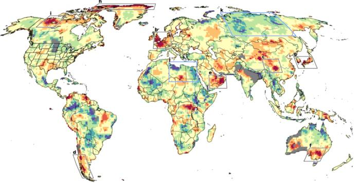
Something squirrelly about this chart.
I live in Western Australia where it shows grey areas bigger than some countries. The grey colours are presumably missing data, except that smack in the middle of those is the capital of Western Australia, Perth and several other populations centers.
Blame the author for not putting a caption.
Here’s the paper: https://www.pnas.org/doi/full/10.1073/pnas.2411258121
Gray areas are not missing data, they’re areas where weather was becoming less extreme rather than more.


