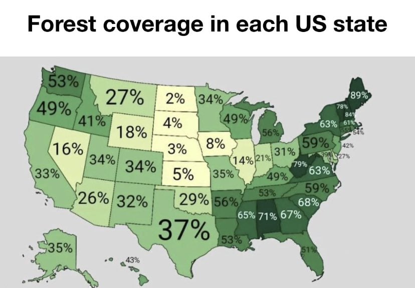
Because it’s not evenly distributed, but a good 30% of the state is heavily forested and another good 20% is forested but not heavily so. The map gives an impression (for each state really) that it is an even distribution in some way. Really, doing this in a state-by-state way as if political boundaries all made geographic sense is not very informative.
I would expect most to not be evenly distributed. Florida’s forests are likely largely the Everglades, and I’d suspect New Mexico’s are up north outside the desert.
And yeah, here in Ohio the remaining forests are largely in the south, but we were once a very forested state


What exactly is deceptive about that?
Because it’s not evenly distributed, but a good 30% of the state is heavily forested and another good 20% is forested but not heavily so. The map gives an impression (for each state really) that it is an even distribution in some way. Really, doing this in a state-by-state way as if political boundaries all made geographic sense is not very informative.
I would expect most to not be evenly distributed. Florida’s forests are likely largely the Everglades, and I’d suspect New Mexico’s are up north outside the desert.
And yeah, here in Ohio the remaining forests are largely in the south, but we were once a very forested state
I don’t why you get an impression from the original infographic that it implies even distribution. I don’t get that at all.
It’s a safe bet most of these aren’t evenly distributed.
I would wager Maine is fairly evenly distributed, but that seems like a safe bet.