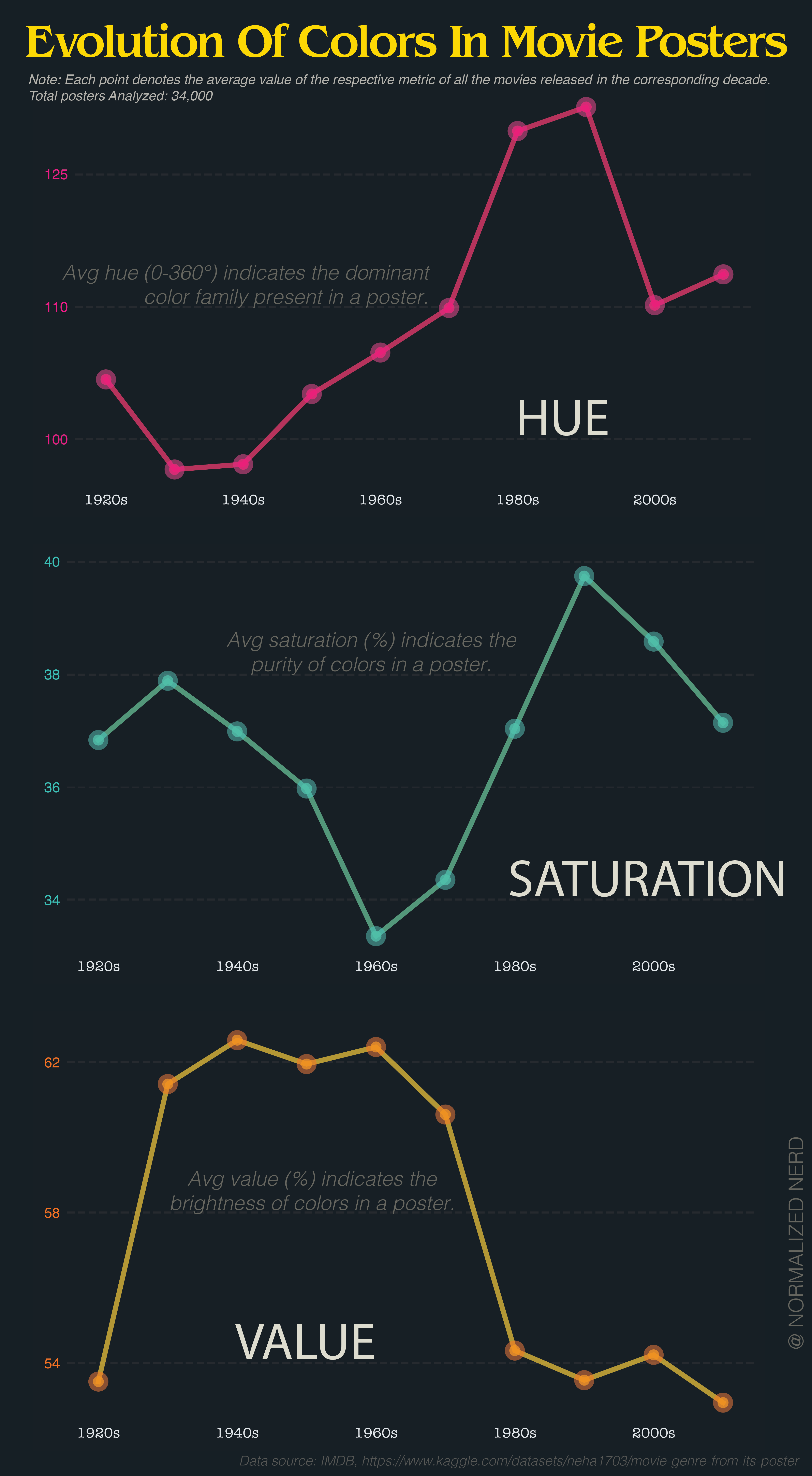
Be nice to have the y axis start at zero so we could get a realistic sense of the fluctuations.
Yes yes this is pedantic for a chart about movie posters, but we’re all pretty desensitised to disinformation; feels useful to train myself to recognise it & speak out about it. The y axis isn’t visible, so the chart is misleading 🤷♂️
The values changed so little compared to the full spectrum it wouldn’t make sense.
You’re not comparing to zero, but relative to values over time.
I agree with how it’s presented.
Zooming out a little would at least show that the changes are minor.