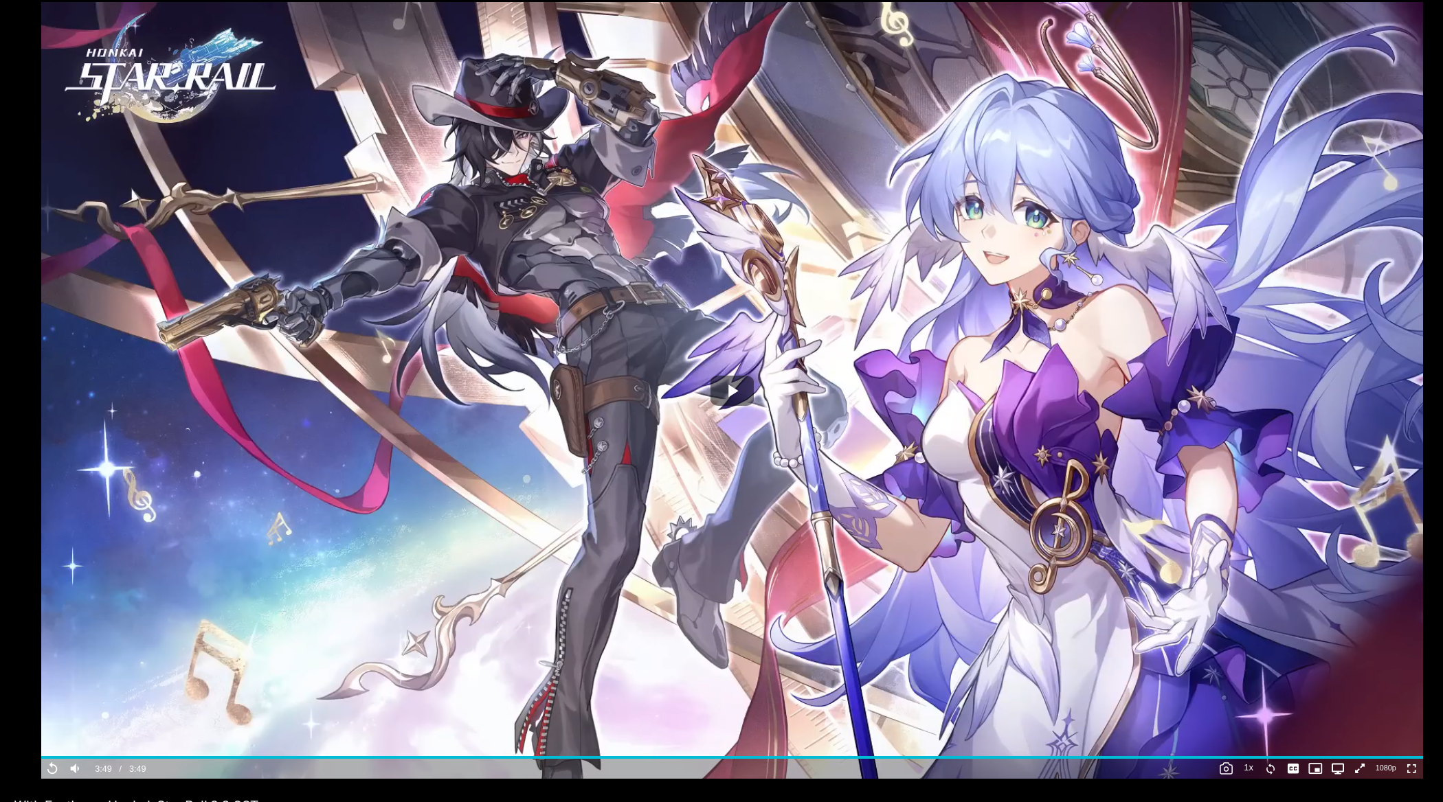
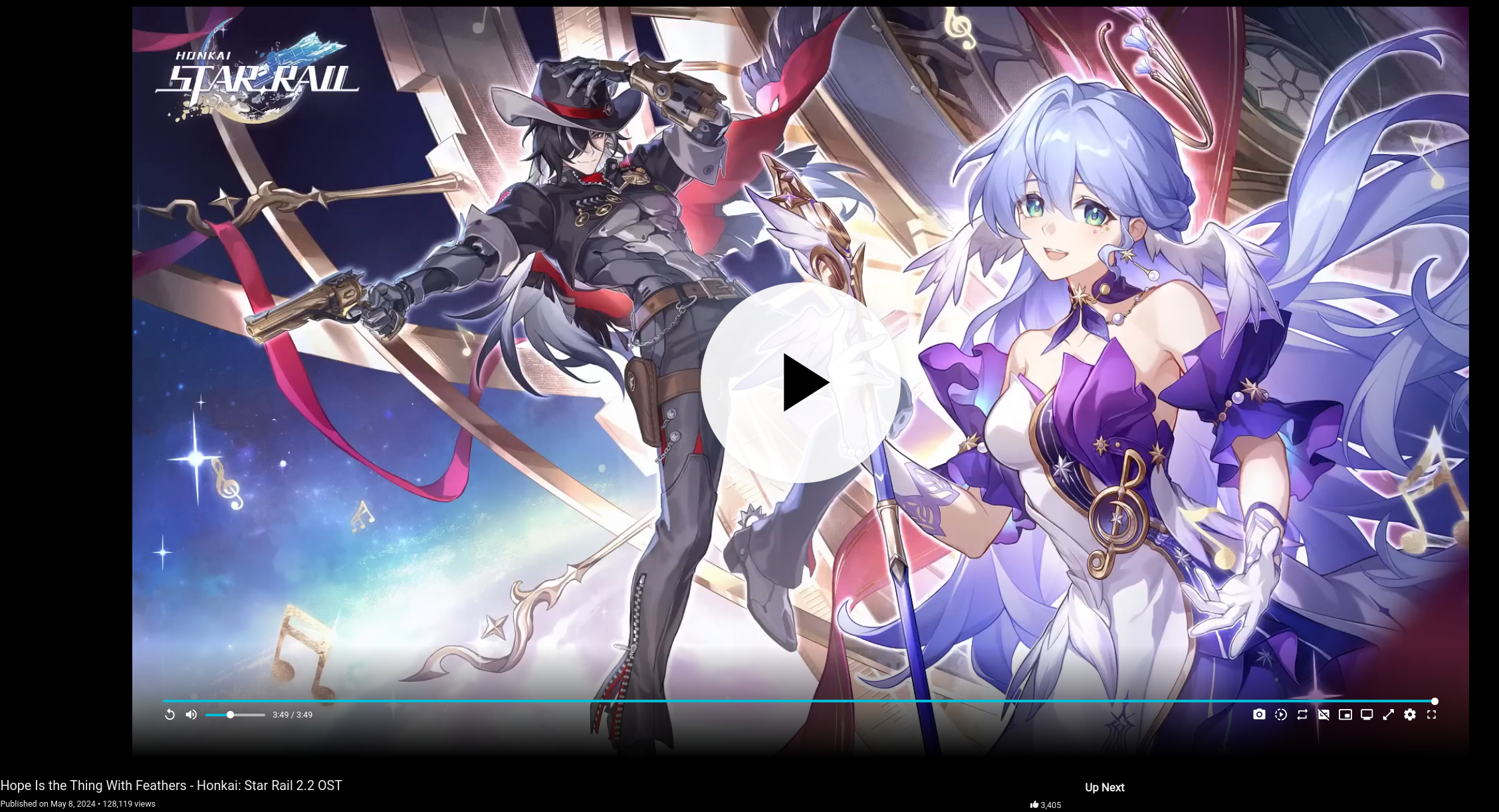
Honestly has me upset enough that im starting to set up a super old youtube setup i once had years ago in the before times
i just might rawdog youtube directly again old player also had the progress bar visible even when not focused, not anymore
over a years worth of work and we ended up with what looks like a mobile ui


Crap, so that’s what I should expect to come down the line? Not a deal-breaker for me, but it is going backwards.
gotta go back up the pipeline if the trend continued downwards, which means invidious for me
I’m sure someone will fork a build to keep the legacy UI. Seems like it would be easy to NOT include the code that uglifies the UI like that. LOL
i asked them if they could keep a legacy option or let us change the ui only, the reply was that they worked on it for over a year and wont be changing it back cause i cant get used to it
bro,k your team took over a year to not align the ui with the video
A year of work… for something that NOBODY asked for or even wants? That’s a shame. I’d expect that from Google, but not a team working on an open-source project.