This video has good stuff in it. I promise it is worth the watch.
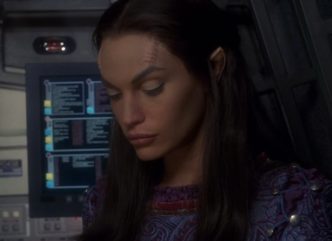
I somewhat disagree with the ingenious GUI in Star Trek. After decades, I still look at these Star Trek Interfaces and do not understand how they work, what the information hirachy is or what a buttons is or what is just passive Elements. I give him the benefit of science-fiction and my weak 20th century brain is not ready to understand 2290s graphical user interfaces but for me it is just artwork and I bet GUI in Starfleets in the future will not look like that at all. I love the GUI asthetics of more modern sci-fi movies where I can actually understand why there is a CTA, why there is a diagramm on how to navigate it. But the gap between what Okuda did and what we see on phones, tablets and the general web today are worlds apart. He did a somewhat great artwork, but was not able to give a realistic outlook on how human-machine interaction in the future will look like. It also aged poorly and still feels like the orange-chic of the 70s and did not made the asthetic upgrade that the ship design and costume design did in the series. That man might be a legend, but his understanding of GUI is somewhat weak in comparison with other sci-fi artist. And I take the foaming downvotes for that but it has to be said at least once on the internet.
You aren’t wrong here. I think he was inspired by the touchscreens that were available at the time.

Truth be told, he was designing a GUI from scratch before the concept of UX existed. I think the emphasis on actors hitting the same thing in order to do one action was innovative. So yes, while the GUI or UX doesn’t make sense, the graphic design does, which is the whole point of the video.
How do you not know what button 8407 does?
/s
What is your opinion on the modern LCARS seen in Picard etc.?
I’m going to say we’re actually heading in this direction, though it will ultimately be different. We haven’t really been using touch screens all that long, and we’re still figuring out things. What’s more valuable than an app icon? One that also tells you the date, or how many emails you have. We’re just starting to delve into widgets, live tiles, and contextually sensitive icons. Maybe we have an agenda widget, what it does when you tap on it changes based on the time. 5 min before or after you have to leave to make it to your appointment, the tap opens maps with the route already up. 5 min before or after the start time, the app opens what ever meeting tool you using or your phone app and connects you to the meeting. All other times it opens your calendar. That’s what we could do with an LCARS-type dynamic interface. The major difference is in how we use computers today vs how we used them when LCARS was dreamed up. Back then it was all about the flow of data, so all the context sensitivity in LCARS was about routing and flow. It would be much more PDA driven if reimagined today.
So I see a future where something like LCARS makes intuitive sense, but it would suite our way of using computers and not be so focused on data routing and flow.
Also helm control being LCARS would be terrible. Better to have a pilot with HOTAS controls and a navigator using LCARS, or else just have the ship limited to very slow bulky movements, and HOTAS in the shuttles and fighters. Maybe humans could adapt to touch screen piloting, but I don’t see how with so little feedback.


