I love the server but I still don’t like the icon. Here are my submissions for possible alternatives:





I do like the idea of a globe icon. Ruud seems to like matching his instance of Mastodon’s icon.
It’s 100% up to him, I think, but to me these ones look nice.
I agree the current icon isn’t great but I’m also not a fan of any of your suggestions since none of them include the Lemmy “mascot”.
I gotchu fam

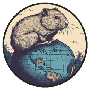


Oh I really like the first one! It’s simple enough it wouldn’t look weird when made into a small logo.
Very nice.
I actually really like the last one, with the vague globe and trees, and I think it would work for the page header and other places where you can see it clearly, but I think the two more cartoonish ones would stand up better to being shrunk down to the browser’s tab bar. Of those two I like #3 better than #1.
Okay, last one before I actually get back to work: 🙂

Cropped and zoomed so it works as an icon with the mascot still discernable, and looks nice when the server masks it into a circular shape, but you can still see the curvature so that the “world” theme is faintly present.
This is more like it. 3 & 6 are nice
Number 3 and 7 are both great. 👍
Some quick stuff I put together roughly based on these:


(Maybe wanted the ears in the circles, but scrapped these up real quick, so yk 🤷♂️)
Yah I like these too. I like my world icons enough that I feel like maybe the official Lemmy graphic over one of my worlds would be nice, but also, I’m not sure if there’s even interest on @Ruud 's part for any of this. So IDK how much more time to invest in it.
Also, I just like using AI to make icons; it’s enjoyable for me. 🙂
My fav is #3. Simple enough that you can decipher it in a small format while clearly communicating what it is.
1, 3, and 7 are the best. Did you make them yourself, or are they AI-generated?
All 100% AI generated; if I made them myself they’d look like lumpy stick figures. 🙂
Still looks great, nice one!
I noticed you oriented the icon with the northern hemisphere on top.
https://youtu.be/vVX-PrBRtTY?time=206
Just the first thing I thought of ;-)
Heh. Right, I actually specifically liked #3 of the no-mascot options because there’s a subtle alteration that includes pretty much the entire globe (western hemisphere + almost all of Asia) in one graphic, which is nice. But on the other hand, we had to rotate Japan and Australia out of existence so we could get Alaska in the picture.
I really like #4 and #6. I could see using one of those with the LW superimposed on top of the globe.
aww cute, i like these
Okay, last iteration:


