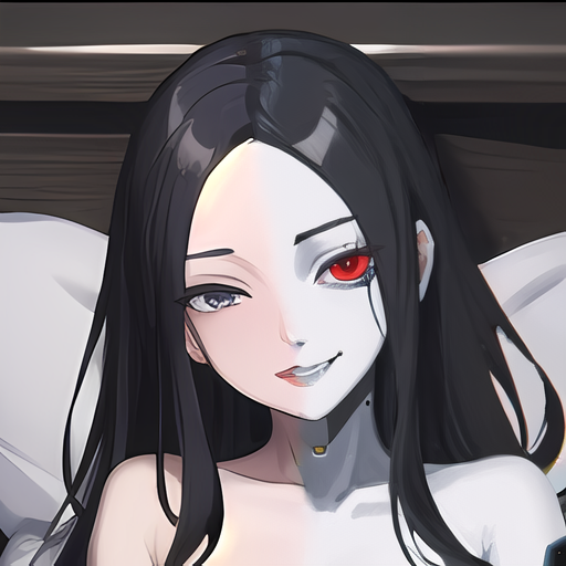
An attempt at making a magical world full of beautiful, busty magical women. You would imagine that charms to see through clothes would be common. The academy is seperated into different areas depending on the field of study, but the gothic theme is visible throughout,
This one was a lot of the inpainting sketch tool to color over the clothes and attempt to get nudity instead.


These are really good! I love the on/off juxtaposition you achieved with inpainting.
When you inpainted, did you change the prompt? Did you alter the clothing/style to nude? Did you paint over just the body region? Did you apply LoRa’s? Can you give a bit more details in your process? I would like to do something similar with future generations.
Anyway, this is 10/10 stuff.
WHEW! This took me way longer to make than I had planned, but here is a breakdown of what I did with visuals of the in-progress images.
Initial selection
First, I started with this prompt:
Prompt 1
gothic architecture, dark interior, orange and brown clothing, leather straps, goggles over eyes, steampunk Steps: 20, Sampler: Euler a, CFG scale: 7, Seed: 2090741048, Size: 512x512, Model hash: d85fe79733, Model: pureRealisticPornPRP_v10, Version: v1.4.0
Which gave some weird results on the goggles. I ended up removing that and contining.
Prompt 2 - With the goggles
othic architecture, dark interior, orange and brown clothing, leather straps, steampunk Steps: 20, Sampler: Euler a, CFG scale: 7, Seed: 4160286062, Size: 512x512, Model hash: d85fe79733, Model: pureRealisticPornPRP_v10, Version: v1.4.0
But that was too zoomed out and gave me horror movie vibes. So I added “Busty” which zoomed the perspective in quite a bit.
Prompt 3 - Add busty
gothic architecture, dark interior, busty, orange and brown clothing, leather straps, steampunk Steps: 20, Sampler: Euler a, CFG scale: 7, Seed: 3984055655, Size: 512x512, Model hash: d85fe79733, Model: pureRealisticPornPRP_v10, Version: v1.4.0
I liked what was showing up now, but had to try a few outputs to find the one I liked the most.
Refining the face
The next step was the improve the facial expression. The first face was a little too young looking and I wanted something more sultry, powerful, and interesting. I just slapped “beautiful face” on the front with the hopes that it would work, selecting just the face with inpaint.
Prompt 4 - Beautiful face
beautiful face, gothic architecture, dark interior, busty, orange and brown clothing, leather straps, steampunk Steps: 20, Sampler: Euler a, CFG scale: 7, Seed: 3971760054, Size: 512x512, Model hash: ed989d673d, Model: dreamshaper_7, Denoising strength: 0.61, Mask blur: 4, Version: v1.4.0
Fixing the hands
The next challenge was the hands. The hand on the right (her left) was fixed the first time through, but the left hand (her right) was a bitch. I went through SO many just to get something remotely acceptable. In the end, I just replaced the entire prompt with “hand on railing” to fix it. It added a weird wooden bump to the railing, but I was frustrated enough to be happy with that; although the titty hands were funny.
Prompt 5 - Hands on
hand on railing Steps: 20, Sampler: Euler a, CFG scale: 7, Seed: 2838562780, Size: 512x512, Model hash: ed989d673d, Model: dreamshaper_7, Denoising strength: 0.35, Mask blur: 4, Version: v1.4.0
Take it all off
The last round was based on using inpaint sketch to add skin color over the clothes. I found it didn’t have to be very precise, but a little extra work of adding some shadow and highlights helped define positioning. If I were better at art it would probably make a better result. I also forgot to adjust the prompt to remove mention of clothing before running it through inpaint again with the now covered (exposed?) body.
Prompt 6 - Just get naked
naked, beautiful face, gothic architecture, dark interior, busty, orange and brown clothing, leather straps, steampunk Steps: 20, Sampler: Euler a, CFG scale: 7, Seed: 108340193, Size: 512x512, Model hash: ed989d673d, Model: dreamshaper_7, Denoising strength: 0.75, Mask blur: 4, Version: v1.4.0
Finally I remove those mentions of clothing and ran it through a few more times. I had to keep selecting spots to fix and even add more color in the inpaint sketch tool to fix the hip. I’m still not happy with the bits of straps on the stockings, and I could probably have fixed that by just turning down the inpaint mask blue setting, but I didn’t figured that out until later.
Prompt 7 - Bring it home
naked, beautiful face, gothic architecture, dark interior, busty Steps: 20, Sampler: Euler a, CFG scale: 7, Seed: 4085514479, Size: 512x512, Model hash: ed989d673d, Model: dreamshaper_7, Denoising strength: 0.75, Mask blur: 4, Version: v1.4.0
Hope this helps in future projects!
Wonderful write up! Thanks for sharing all the intermediary pictures. The tit hand is hilarious.
I was especially impressed with your shaded inpainting. I didn’t know you could do that. You selected the different colors? I guess you found that using a little more sophisticated shading colors got you better results than painting over everything black? Inpainting is still a bit mysterious to me.
You know, I’m not realizing that I’m using “Inpaint sketch” to color over the clothes, but there is actually just a tab labeled “sketch” which is what I am actually doing. I guess every tool is a hammer.
I think of inpainting as a selection tool, you select the area you want to make adjustments to. That would make the sketch tool a way of suggesting what something should look like. I suppose the inpaint sketch tool would just combine the two, which I have been doing manually. Still so much to learn!
Here is a screenshot of the interface with the different tools at the top and the option to move the image between them at the bottom. The brush size and color select are in the top-right of the picture area.
Thank you for your helpful tips and explanations! I find it hard to “paint” with my mouse but I guess a rough outline is enough to help the prompt do it’s work.