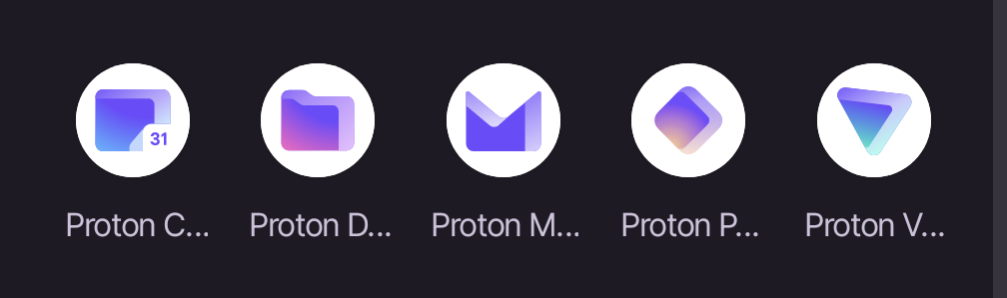
That the labels for the apps get truncated so you can only read “Proton” plus the first letter of the app. I’m only able to distinguish based on the icons which isn’t great because Pass and Drive are similar colors, and Pass and VPN, and Drive and Calendar are similar shapes.
Just as annoyed as I’m with Google’s branding icon designs.