good, but please don’t make it slower
Running natively rather than on the xamarin/maui framework would hopefully mean it’s more responsive. It is a bit sluggish to load right now
til it’s on xamarin, i assumed it was slow to load due to the thousands of rounds of decryption
Unless you’ve changed your vault encryption settings (which is not a bad idea!) it will likely decrypt rather quickly.
I changed mine to Argon2id with settings such that one iteration takes over one second (on a Ryzen 5800X3D, about the same on my phone), since I don’t unlock it very often.
It will be faster, because they are moving off Xamarin. Big win in all regards.
A native app, nice
Material tends to be ugly as balls but if usability improves, that’s great.
I tend to think the modern material doesn’t provide nearly as much opportunity to be colorful and provide a unique visual identity as the OG material did.
Apps like Inbox were works art with the use ux to match
Man I miss Inbox so much. It kept me so much more organized than Gmail ever has.
I actually achieved ✨ Inbox Zero ✨ with Inbox, and I was a teaching assistant at the university with lots and lots of emails pouring in. The concept of emails as tasks, and the features revolving around that core idea made Inbox so powerful.
Nowadays my inbox just keeps filling at a pace higher than I have energy to deal with due to the poor UI.
What really helped me deal with lots of emails was the categorization and bundling. You could sweep a lot of messages that you didn’t care about. You could deal with a lot of emails in a row pertaining to a particular topic, heavily reducing context switching, etc. One of the greatest apps Google decided to retire. It really did fit my mental model of email.
Spark is pretty good, but… It just isn’t Inbox. Just isn’t the same.
It’s also flattening everything which to me was one of the more fun parts of the design with elevation and shadows inspired by layers of paper.
yes, many of these apps feel kind of lobotomized
deleted by creator
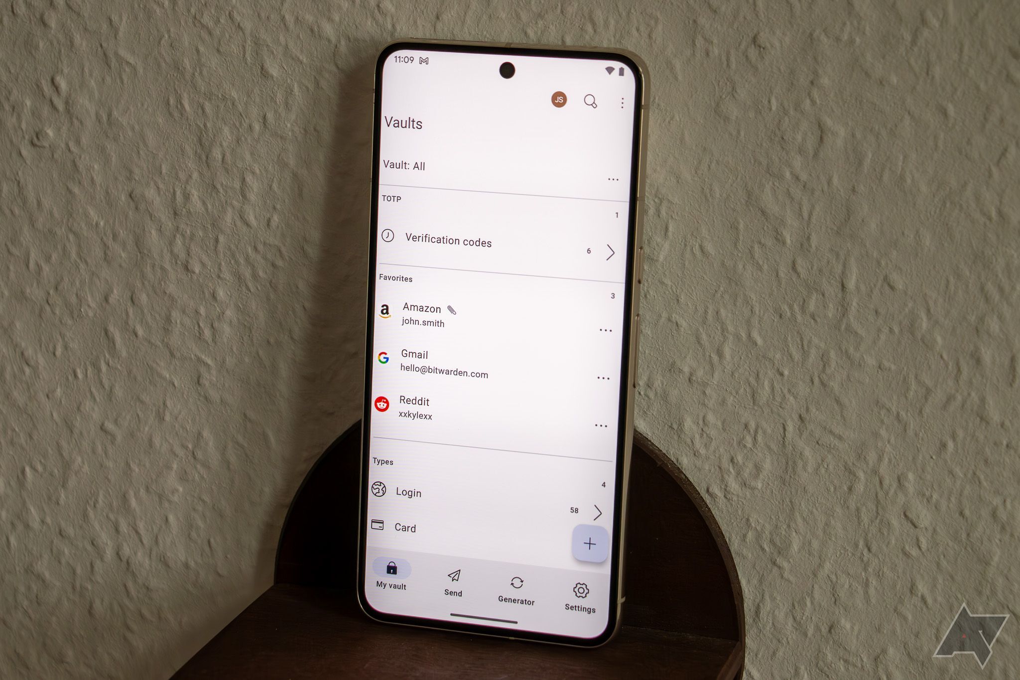
I switched to Bitwarden after 1Password moved to electron and booted selfhosters off the app and into their sub model. Jesus Christ is the current Bitwarden UI bad. It’s easily the worst looking application on my phone that isn’t a banking app; I’ve had zero issues with the functionality though.
Yeah, so in typical modern day fashion get ready to lose functionality.
They often trade UX for “pretty” these days and I find most apps and websites horrible to use in comparison to 10+ years ago. Like everything has to be in a context menu for some reason now.
Nice to see they are moving to native platforms. With this news they took away my only reason for switching to the shiny proton pass.
deleted by creator
Wait, you can’t?
You certainly can in the Android app.
Huh. Odd thing to say then, what the other person said…
Mine used to look pretty OK but then one day it moved everything into a folder named ironically No Folder and because I kinda need the passwords pretty badly I don’t want to try and risk fixing it.
You can always download a copy for backup.
Hopefully the UX improves. Last time I tried Bitwarden it was so much worse than 1 Password.
Good news!


