
You must log in or register to comment.
Seems kinda inconsistent. I’m seeing thin lines, thicc lines, flat, 3d, colored and monochrome all together
The icons don’t all speak the same language, true. Some are way more elaborate and detailed than others, which just makes them look off.
Maybe the library could be a single book instead of an entire bookshelf, for example?
There’s another icon called “folder-book”
Ah, didn’t see that one at first. Even that icon is still too different from the others though, using thinner lines and no fill. Hm
Jesus, it’s so inconsistent. I suppose that may be beneficial when looking at all of your folders at a bird’s eye view but my knee jerk reaction isn’t the most positive.
That looks… really inconsistent
- Why is the mac icon black while the rest aren’t?
- Why are the games/downloads icons offset while the rest aren’t?
- Why are some icons really minimalistic and some really detailed?
- Why do the colored folders have a line while the rest don’t?
- Why are java/android/deb/blender colored while the rest aren’t?
- And why is the black folder blue lol
IIRC they refined the Breeze icons over a LONG period of time to get them to the current state - I’m sure the same will be true here.
These are definitely an improvement over the current icons but while some of the design rules are evident, i think a bit of refining is in order.
The games and download folders both need a complete redesign as the ignore the design rules that the other folders use, and why are the symbols on each folder white except for the Mac folder?
Finally designers are realizing it’s not 2013 anymore and nobody liked the Win8 designed-in-powerpoint style.
…
I’ll be sticking with papirus.
Here is an alternative Piped link(s):
Piped is a privacy-respecting open-source alternative frontend to YouTube.
I’m open-source; check me out at GitHub.
They are… certainly icons. I can’t get any more excited than that I’m afraid
deleted by creator
There are even light and dark wallpapers with transparent version to build your own!
This feels like a step back from what we currently have.
Removed by mod
deleted by creator
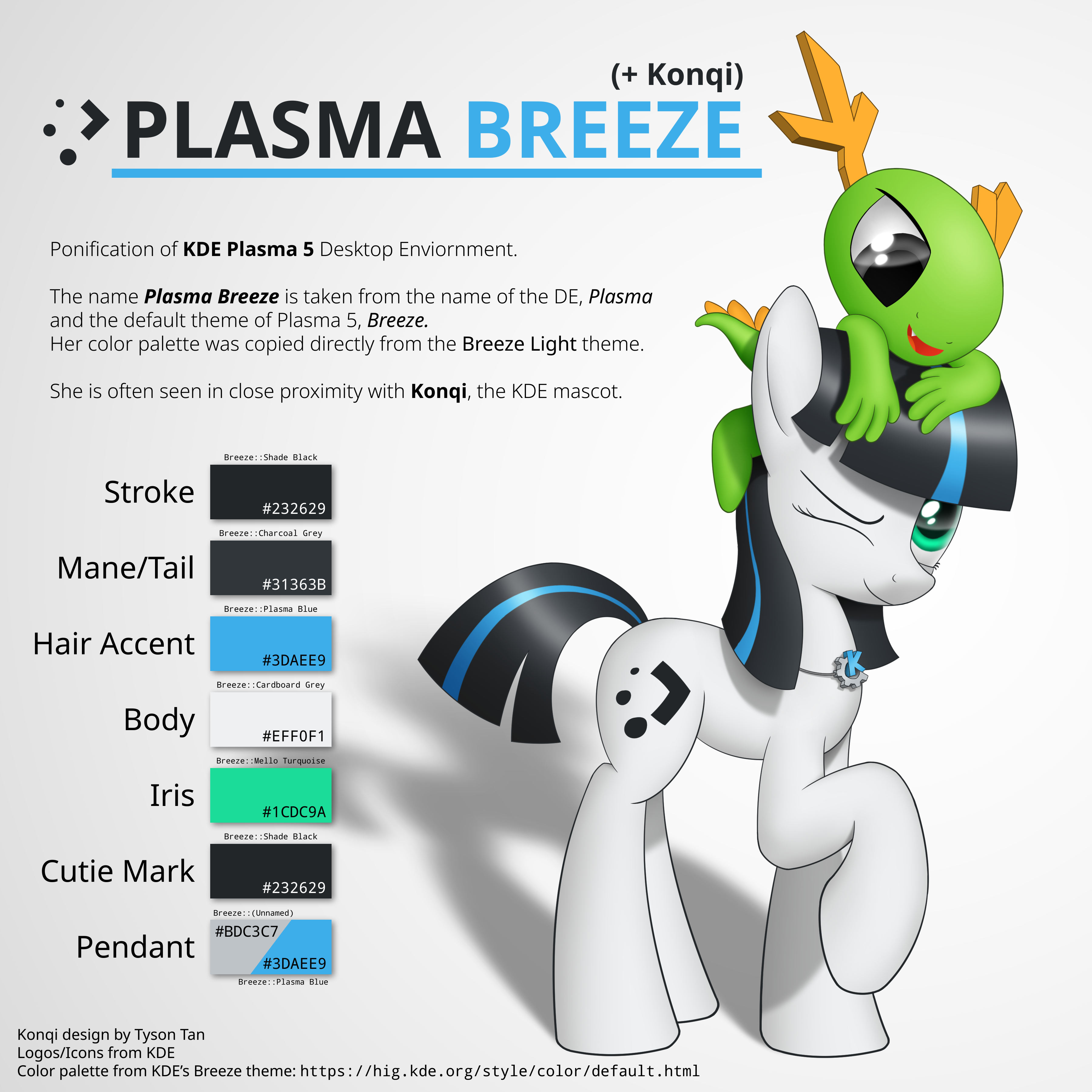
default KDE*
but then I don’t understand who uses KDE and doesn’t kustomize it
I do, i dont feel it looks bad and it works well for me, i used to use themes all the time but i feel the default one is good
deleted by creator
At least to me, KDE feels fairly modern
Ooh, it really reminds me of newaita reborn which is one of my favorite icon themes. I’m glad they’re making it a little less minimal
I’ve seen better designs. But I’ve also seen worse designs. This is pretty meh.
And I was gonna try out KDE anyway.
deleted by creator
Isn’t KDE spearheding HDR support for Wayland? And doing a bunch more objectively good/usefull projects like the xwayland video bridge?
deleted by creator
Looks good to me
Now KDE needs to implement a consistent design language for its apps, clean up its settings, and have better defaults. Not asking KDE to copy Gnome, just that it needs a lot more work to be palletable to someone using it for the first time.
TODO since KDE 3…
I actually quite like the current breeze style with the sharper edges, it sets it apart from other designs.
I’m not the most knowledgeable on this subject, but I’m curious to learn more.
Why do various toolkits have major releases that seem to reset the features of the last one?
GTK 3 seems like GTK 2 but slower to me, and before the transition was even complete GTK 4 showed up, which just seems like GTK 3 but a bit different. Qt 5 works really well and is efficient on resources, so why are we switching to Qt 6? It seems like reinventing the desktop over and over again.
I understand updates for the kernel for compatibility, small to medium updates to all software for bug fixes and new features, and major updates to toolkits when there are big problems with the current release (X vs Wayland for example). Or if the current release was unreliable and bloated, which I heard was what happened with Qt 4 and why they switched to 5. But I also heard Qt 3 was really stable and lightweight, so why did they switch away from it?
Usually there’s big new features that accomodate more modern hardware better. As an example, Qt6 revamps support for Wayland, HDR, and scaling. Even these things on their own don’t seem like much, but if you go back to KDE 5 in 10 years time you’ll definitely feel like something is plain/dated (or completely not working if you’re on new hardware)
Thank you for the explanation! What specifically does Qt 6 do that Qt 5 can’t do?
Gtk 3->4 made a lot of internal changes, and at least some were related to making wayland work. Wayland “worked” in gtk3, however it was very much an afterthought, and half the toolkit was useless under wayland. Other changes are usually required for changes related to rendering, gtk4 had vulcan rendering which may require some breaking changes. Another thing is just general breaking changes that are good, sometimes you realise some decision was bad, and a new major release is just a way to make these.
From the end users perspective nothing much changes, it maybe looks a bit different, but not much besides that. But a vulcan renderer and being fully wayland compatible are major improvements that also improve the user experience, even if you don’t notice directly.
Interesting. I’m guessing the changes were too big to just be added incrementally in updates to GTK 3?
Usually the problem isn’t that the changes are big, but that the new way simply isn’t compatible with the old way to do things, and you can’t just make a change that will break existing applications in minor versions (well, there’s nothing technically stopping you, and unintentional compatibility breaking bugs have definitely happened in the past, but people are gonna get real mad at you if you do that). Even if you break that change up into thousand tiny changes over many minor versions, the end result is that at some point, you break old apps.
The solution is to take note of all the things that are either badly designed or became obsolete and once in a while go “hey, let’s make a new major version and fix all of this crap”. With a new major version, you don’t have to worry about old applications and are free to improve your library in any way you wish, and you also get the option to keep updating the old major version with some maintenance bugfixes so that the old apps keep working well enough.
The unfortunate consequence of this is that old working apps need compatibility updates.


