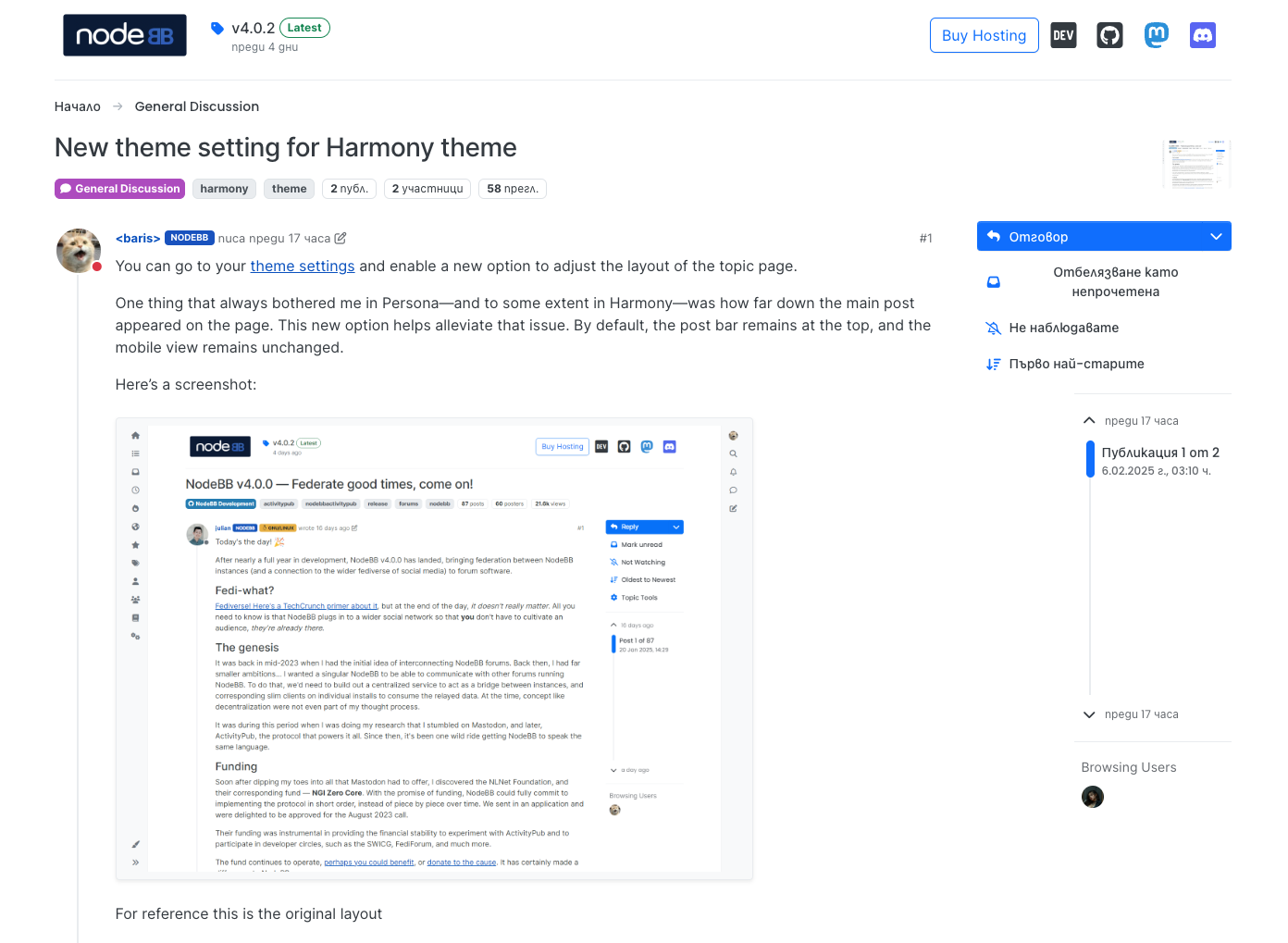
You can go to your theme settings and enable a new option to adjust the layout of the topic page.
One thing that always bothered me in Persona—and to some extent in Harmony—was how far down the main post appeared on the page. This new option helps alleviate that issue. By default, the post bar remains at the top, and the mobile view remains unchanged.
Here’s a screenshot:
Looks fantastic @baris! I am also really digging the new look, and while my muscle memory is still sending the mouse cursor to all the wrong places, I’ll adapt in no time :laughing:
Very nice! I agree, it’s better to have the main post start higher like this.
Finally, what I was talking about back at the start of the introduction of Harmony has become clear. Less garbage and distracting things on top of the post. Just one thing, it looks a little broken, at least for Cyrillic.
@baris When will this be released? Or has it already and I’m just behind :)
It is on master will be released with 4.0.3.