Please share any critiques or comments you have!
I assume you mean critique on the picture itself and not the house? In that case, these are my pointers:
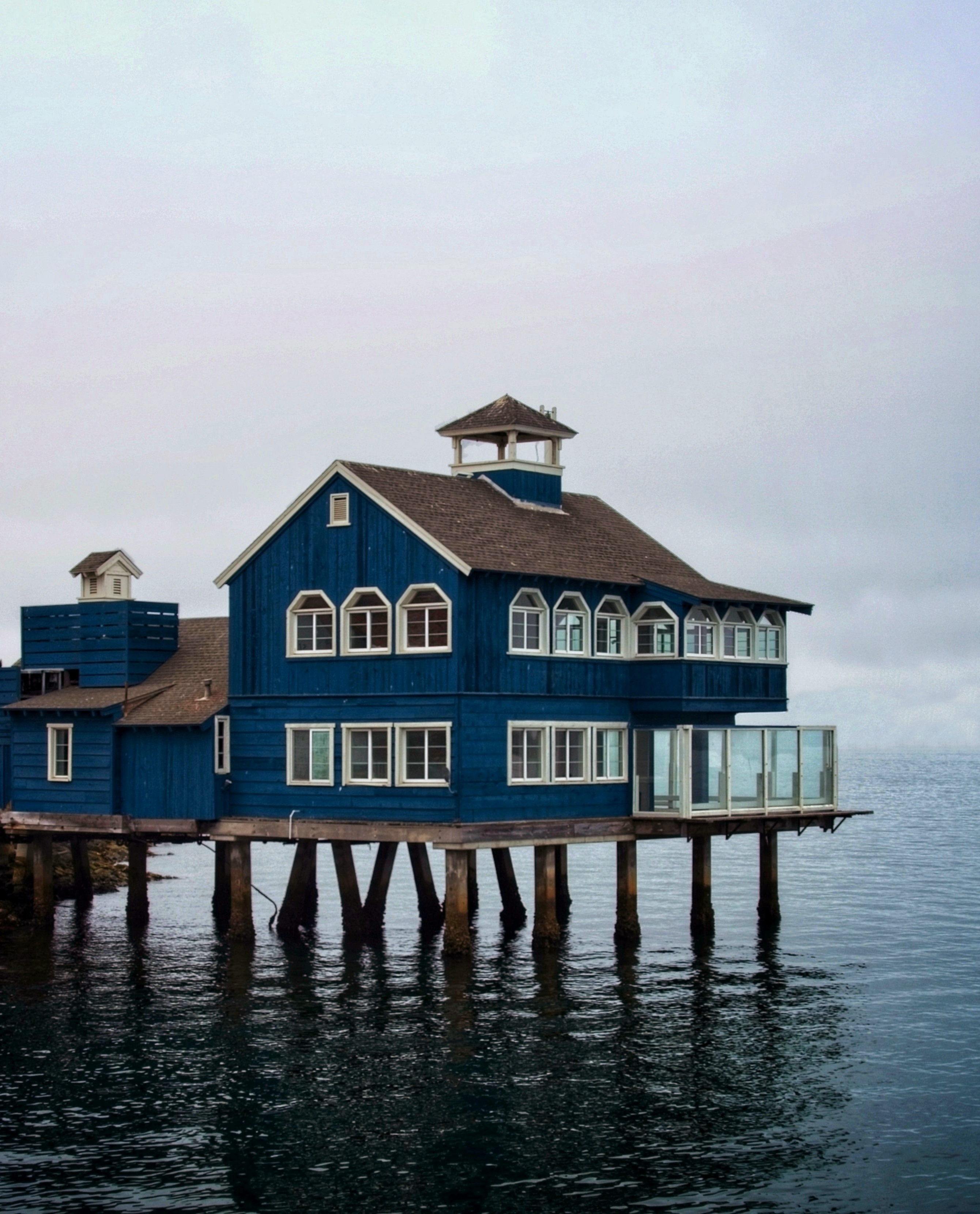
I would have cropped out the railing on the bottom. There’s also a lot of sky in the picture, which is a little over exposed. This leaves the house itself muted and flat. Maybe playing with the levels can fix this and bring out more details.
The angles and location are limited in a case like this. But I feel this isn’t the best angle. The shore side on the left is distracting, especially with the orange roof there. It would be better if it showed more of the water, to give the impression the house is actually on the water.
Otherwise, neat picture! Good find and excellent subject for photography.
I personally really like the muted/flat look, gives the image an older feel to it. It’s like something you’d find in a box of old photos with no explanation, or a movie where people are driving through an area and you catch glimpses of slow paced life that they’re driving past, if that makes sense
Agreed with all that. Depending on how much manipulation was deemed acceptable, I’d also be tempted to paint out the bridge and boats on the right, to suggest that beyond the house lies the open ocean. That’s cheating of course, but it’d look cool I think.
Very rough version done on my phone:

It’d be great to never have to mow again


