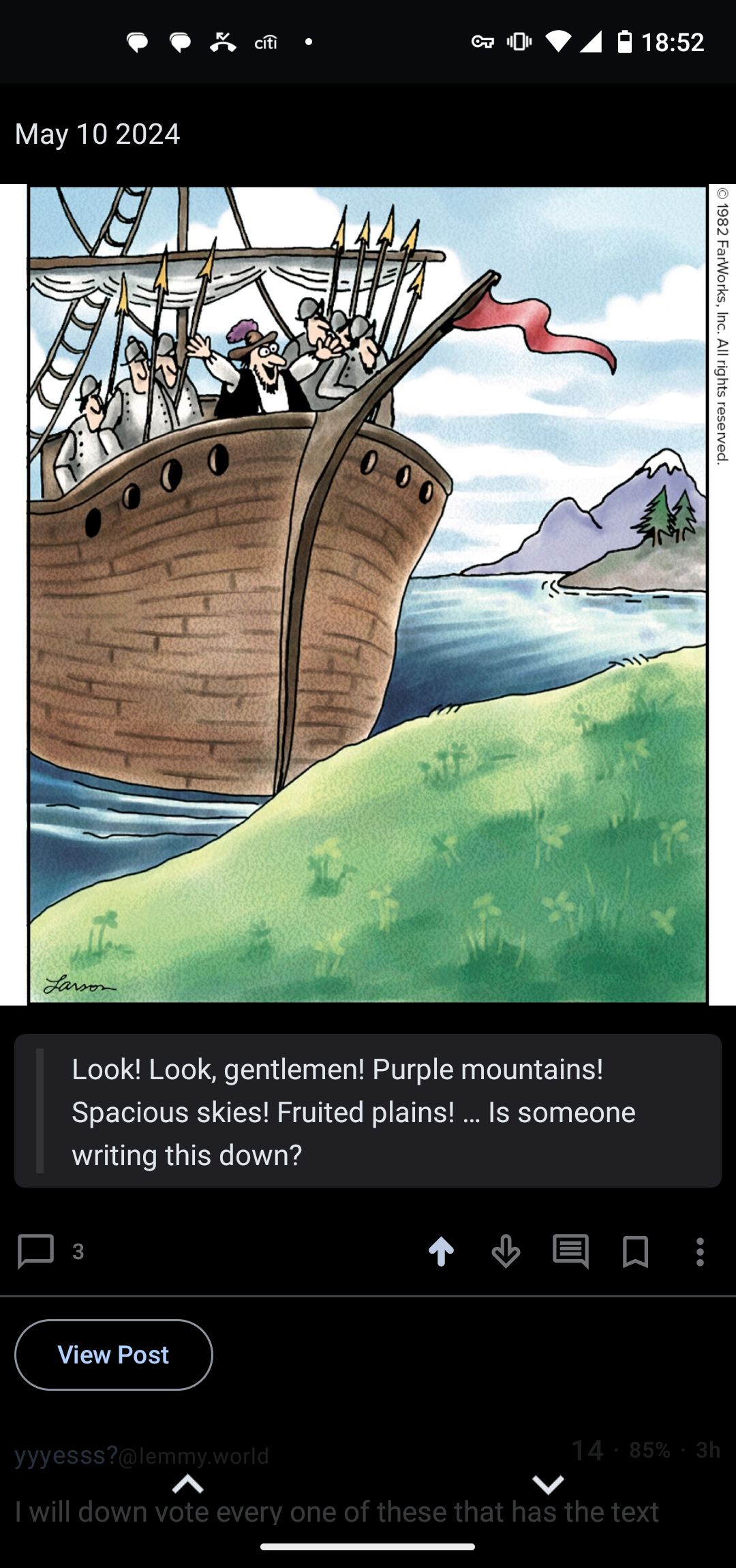
Look! Look, gentlemen! Purple mountains! Spacious skies! Fruited plains! … Is someone writing this down?
I will down vote every one of these that has the text cropped off.
It’s not cropped, it wasn’t in the original image. So I copied the text as the body of my post since it’s text on the original page.
Its just not good. It takes extra effort and who can be bothered
Really? I see both on my screen at the same time. I’m not exactly sure how the normal person does it, but screenshotting each seemed like a pain and would have crappier image quality.
But given the downvotes, I guess people don’t like this method. So I guess I’ll try something else the next time the regular poster misses a day.

F these haters. Glad you are doing this for us and it’s not like anyone else is posting it.
On Connect it shows differently. I have to do a second click to see the text. Very inconvenient…
Just put it in the title text instead of just date?
I tried to follow the general pattern the normal poster does. But since the text isn’t part of the image, I tried this method.
I think putting it in the title would have a similar problem. I’m guessing people are expanding the image, which hides both the title and body.
I appreciate the posts, downvotes be damned. It works for the layout I’m viewing it on just fine


