
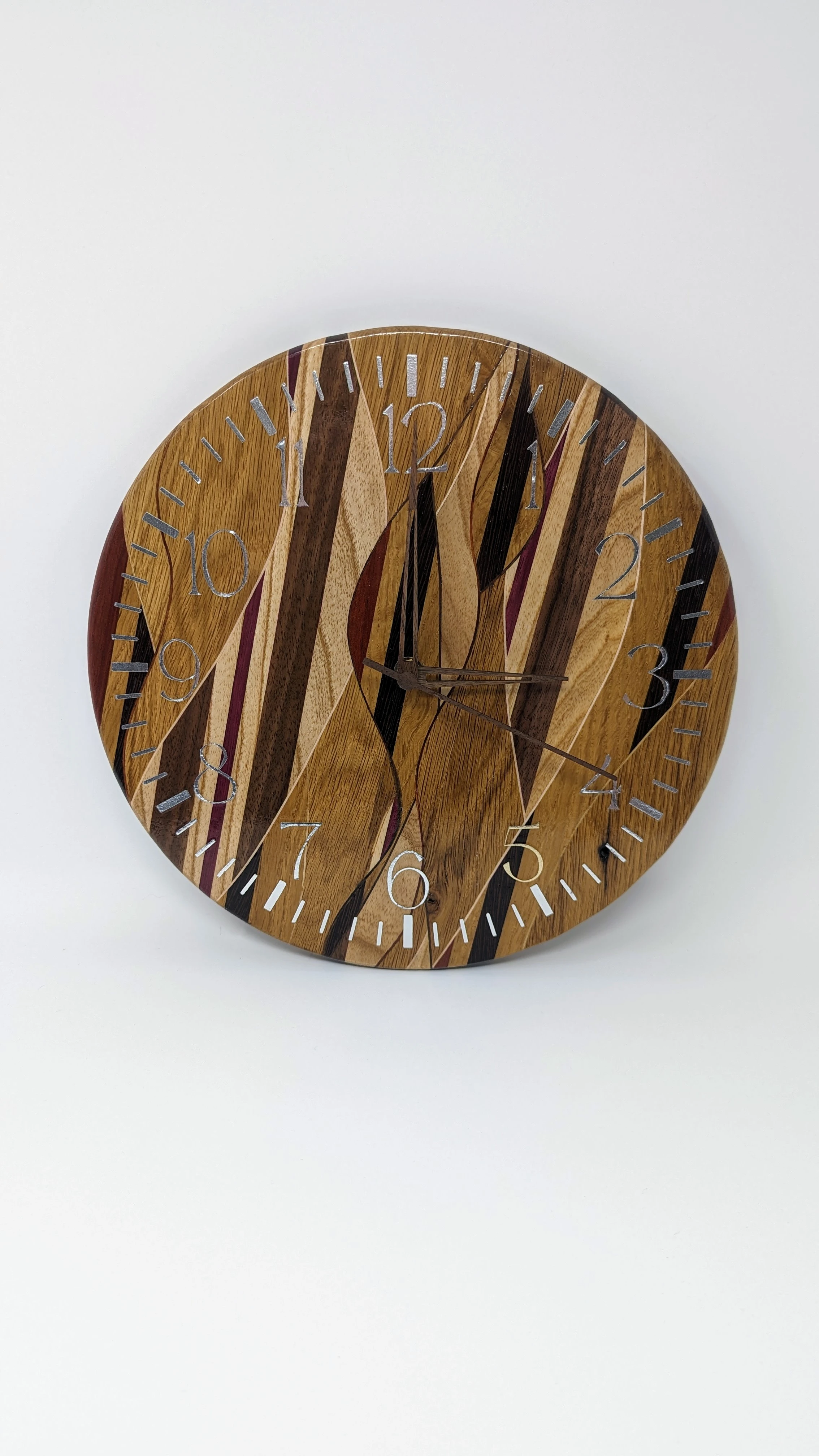
Full disclosure: I didn’t make the clock hands, I just bought them off Amazon.
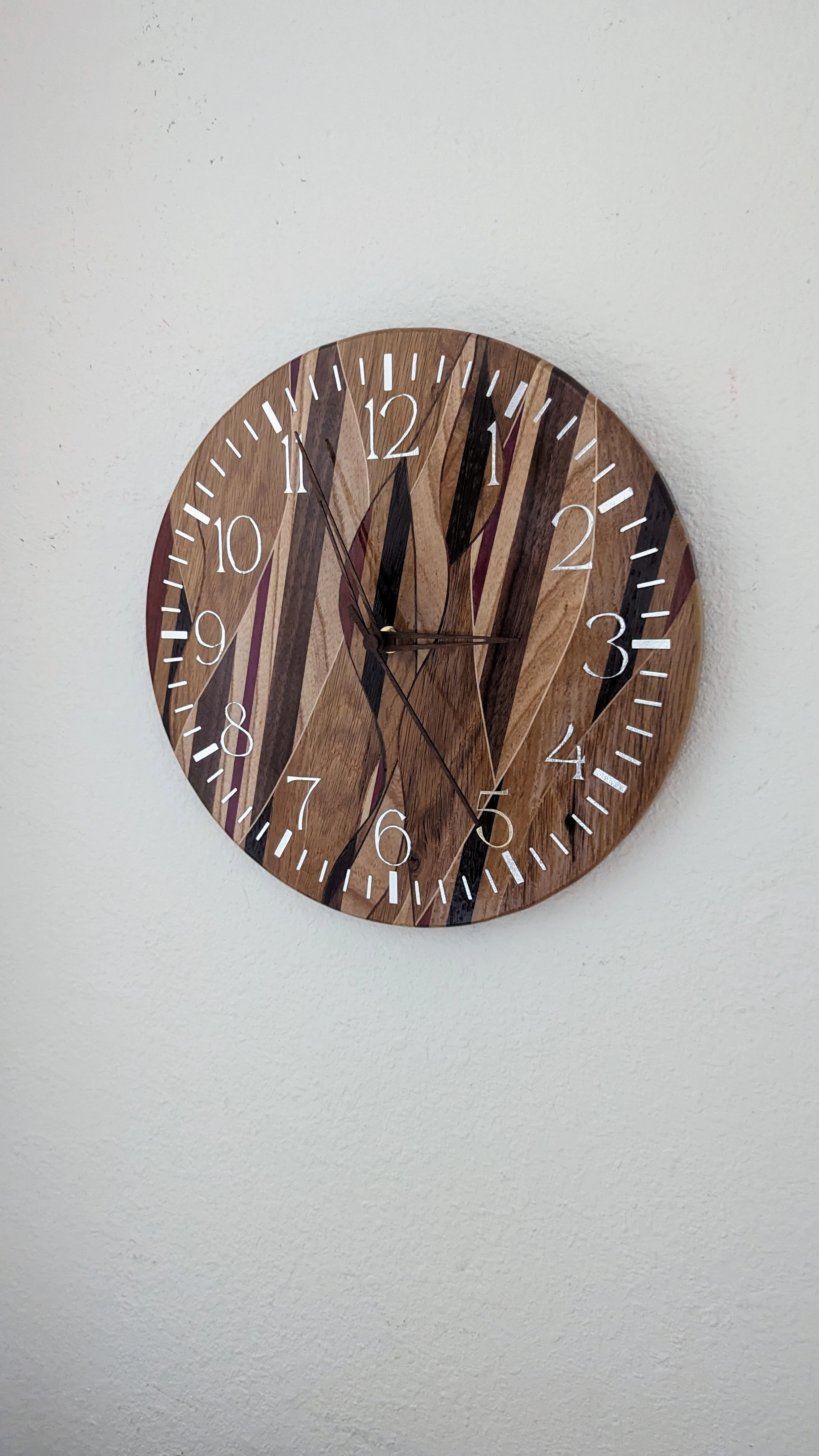
The Majority of the wood used is old (oak?) barn wood taken from the barn that we were married in front of on my family’s farm. You can even see an old nail hole next to a hash mark between the 4 and the 5. Used primarily silver “shimmer” vinyl for the clock face which looks great in person but is an absolute nightmare to photograph. I’ve included a different, if not better, photo as well that shows that part more clearly.
I followed this Fisher’s Shop video to learn how to get my weave on.
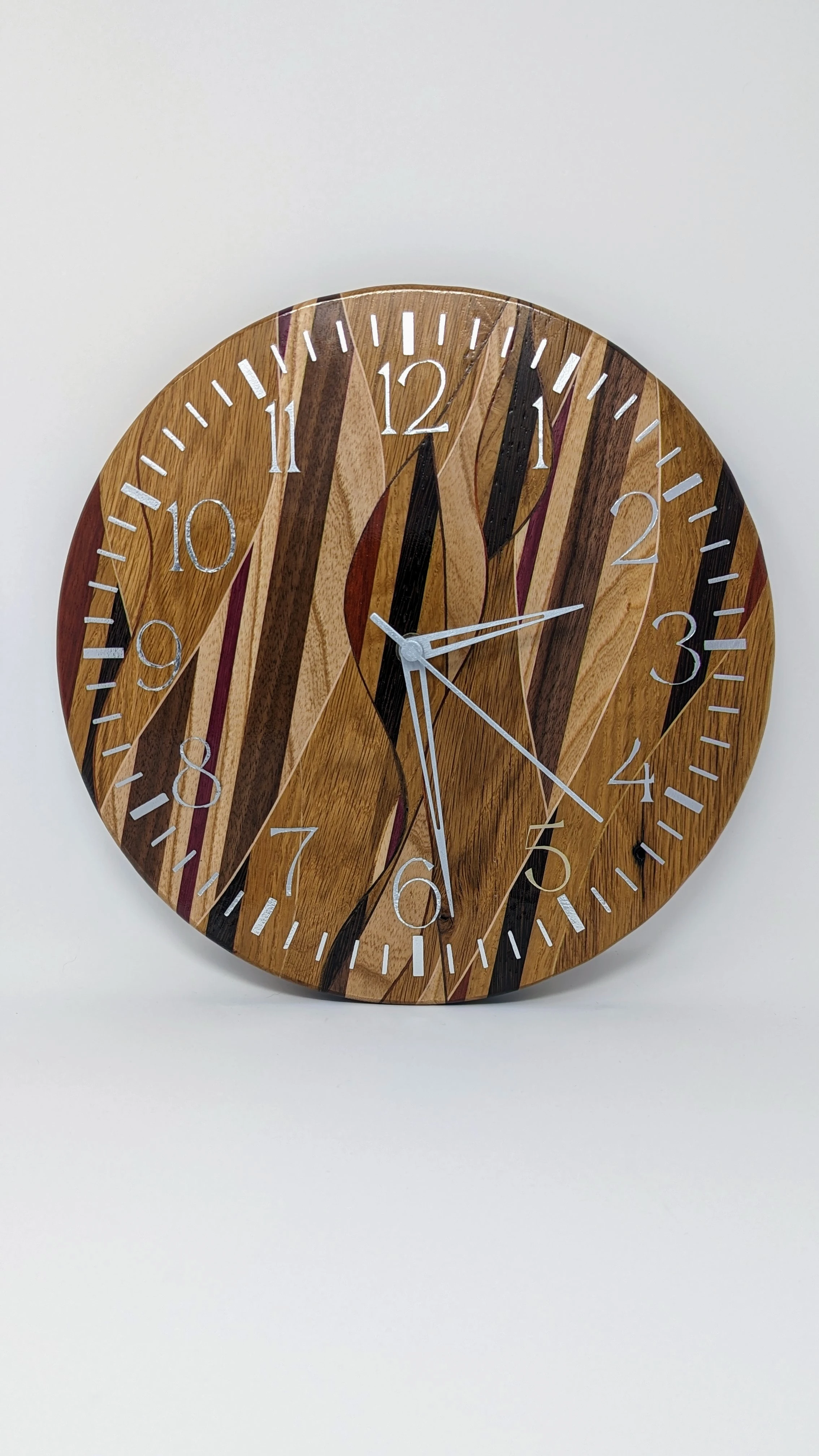
Update: I painted the hands silver and I think it looks much better.
I agree with you 100%. My anniversary isn’t for another week so I might pop the hands back off and paint them. Thanks for the feedback.
Agreed. The hands need to be literally any bright color. White might be tasteful. Red might be striking. Even a bright orange might work depending on the room.
Why not pop the image into a photo editor and experiment?
Edit: I’d also think about whether the second hand adds anything.
Seconding orange. A neon orange would look really good against the wood and be very visible.
Lmao ordinarily Id jump all over a chance to use my favorite color. However we painted an accent wall in our house orange a few years ago because I got to choose the color and that decision still haunts my wife to this day. While I agree it would look really good, I’d only get to enjoy it for a moment before she ripped the minute hand off and stabbed me in the neck with it. In the most loving way possible, I’m sure…
I’m leaning toward metallic silver or flat white. I’ll post an updated image here later for y’all. I appreciate all of the feedback!
What about turquoise? As the opposite colour, it would be a good accent for the orange wall and still visible against the wood while looking good.
If I wasn’t renting I would totally have an orange wall too.
While that is an excellent idea we already have one of my monstrosities hanging on the accent wall. This clock will most likely go in our bedroom.
Bonus picture of monstrosity:
What molecular structure is your monstrosity of?
Oxytocin, the love drug. It’s “Live, Laugh, Love” but for nerds.
If your wife had a non-traditional dress color, I’d pick that if possible.
That is an excellent idea, however she wore a traditional white dress.
I will say that the second hand does add an elegant constant motion around the face that doesn’t translate well in a photo. I was particular about the kit I ordered to make sure I didn’t get a herky jerky tick tock clock. But thank you for your feedback!